Color Trends for Spring
29 de setembro, 2025
With each new season, nature reinvents itself. It doesn't just change color; it invites us to feel, renew, and seek new beginnings. Spring 2025 arrives with a color palette that goes far beyond visual trends. Each shade is a language, an emotion translated into pigment, ready to inspire not only design, but people and brands.
These colors are an invitation to look to the future with hope, embrace the vitality of the present, and translate the feelings that move us into art. They are proof that color has a purpose.
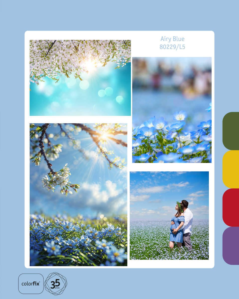
Airy Blue: The Lightness of New Ideas
Airy Blue is not just a blue. It is the calmness of the open sky on a sunny day, the promise of new ideas, and the freshness of a new beginning. It is a shade that symbolizes purity, clarity of thought, and the tranquility we need to dream and innovate. In design, it brings a sense of spaciousness and lightness, like a sigh of relief that calms the mind and opens space for creativity.
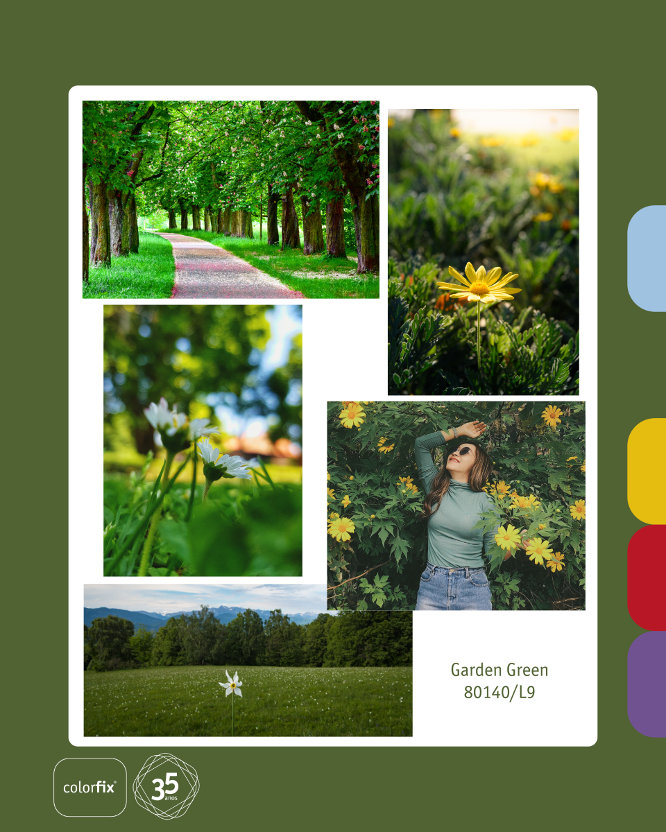
Garden Green: The Balance of Vitality
Garden Green is the pulse of nature. It is the color that reminds us of the vitality that springs from the earth, the silent strength of forests, and the essential balance of life. It connects us with nature, health, and growth. In design, it is the anchor point, the tone that brings harmony, renewal, and a sense of well-being that only nature can provide.
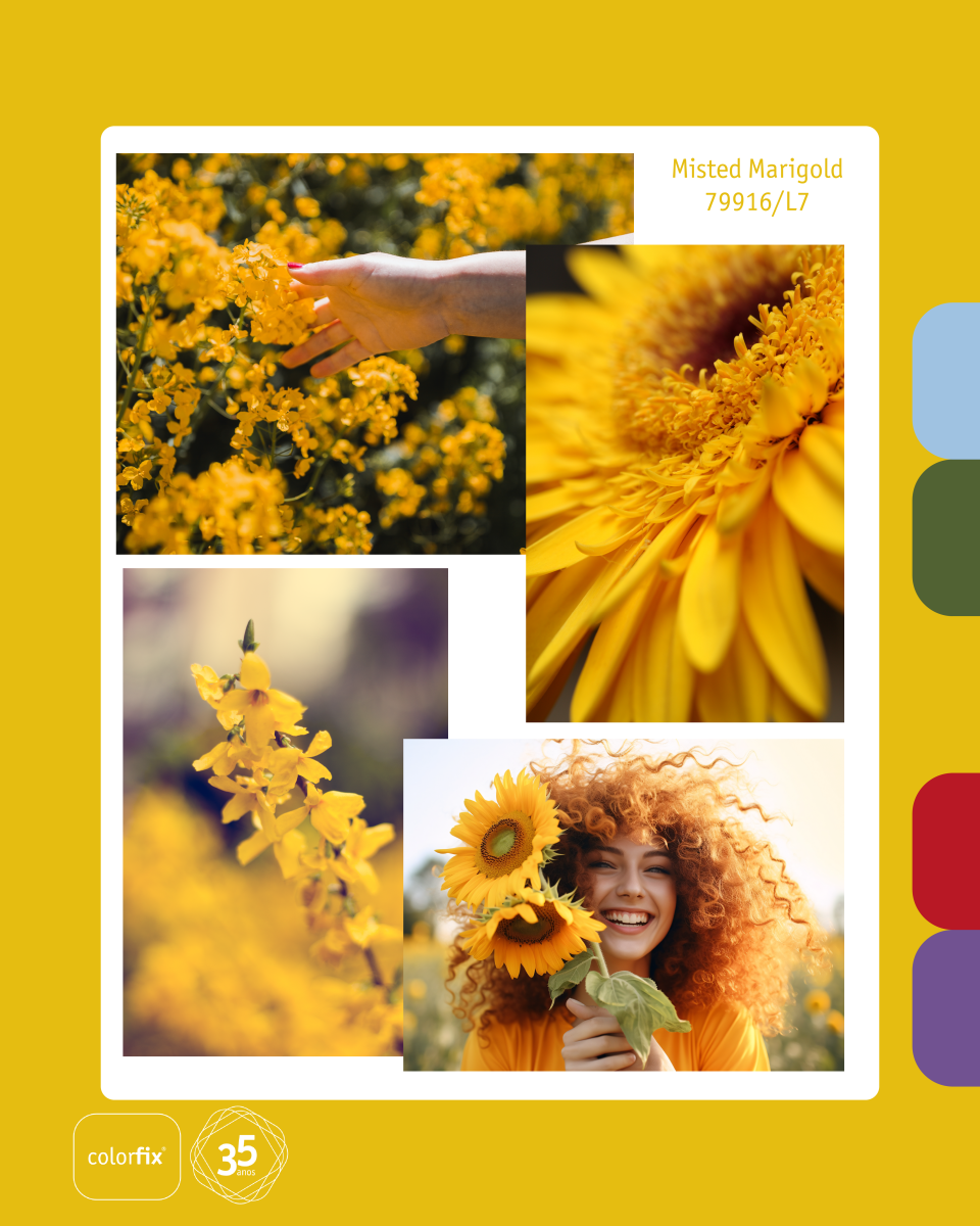
Misted Marigold: The Sweetness of New Beginnings
Soft and golden, Misted Marigold is the color of warming light. It carries the promise of new beginnings and the hope that blossoms after winter. This shade evokes the joy of dawn and the sweetness of happy moments. It is a color that brings warmth, optimism, and a touch of coziness to any project.
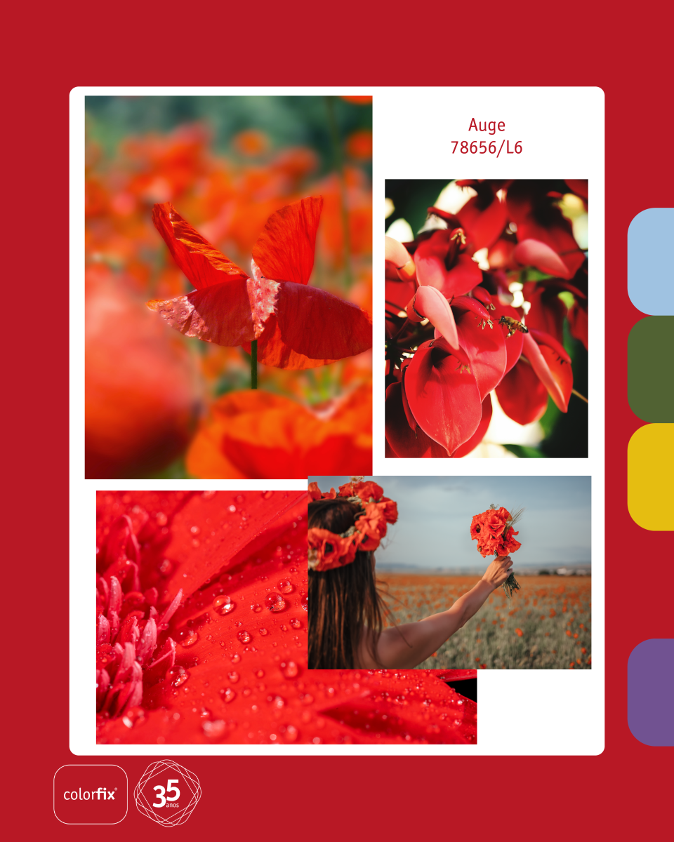
Auge: The Power of Action and Energy
Auge is momentum. It is the color that represents pure energy, constant movement, and the power to turn inspiration into reality. It is the spark that ignites creativity and passion in any endeavor. In design, this vibrant tone does not go unnoticed; it is a focal point that demands attention and reflects a bold and determined attitude.
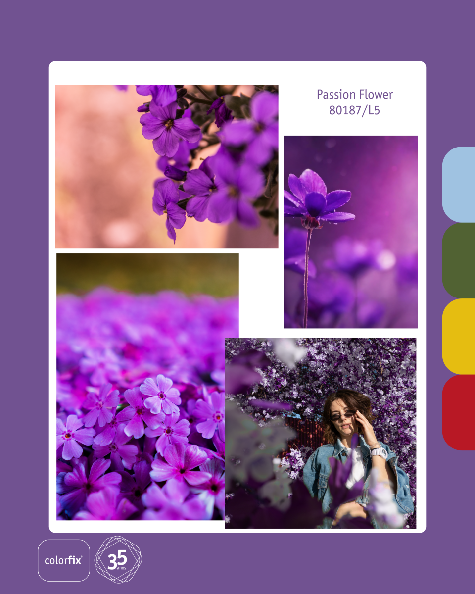
Passion Flower: The Intensity of Human Creation
Passion Flower is a color that speaks directly to the heart. It blooms with intensity and sensitivity, awakening our most human and creative side. It is a color that reflects the complex beauty and depth of emotions. In design, it infuses passion, mystery, and a touch of elegance that elevates any concept, making it memorable.
The Palette That Connects Us
Spring 2025 isn't just about seeing beautiful colors; it's about using them to tell stories and convey feelings. This palette reminds us that color is a powerful tool for communication and for creating purposeful design.
Which of these colors most inspires your next creation?
CONTACT US
I want to subscribe to the newsletter
I agree with the privacy policy


-

- SOCIAL MEDIA
- NEWSLETTER
